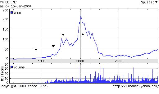
Based
on this stock chart of Yahoo, Inc., how do you think the stock
performed back in 1996 and 1997? Right. You can’t even tell. The range
of values from that time period is basically a flat line. Why? On a
linearly scaled y-axis that goes from 0 to 250, an increase from 1 to
10 appears inconsequential because 10 points are such a small part of
the 250-point range that is encompassed. However, in percentage terms,
this “small” increase from $1 to $10 is a whopping 1000% increase!
Shouldn’t a stock chart visually convey such a significant percentage
increase? In fact, as far as an investor is concerned, a move from $1
to $10 yields the identical return as the 1998-1999 move from $10 to
$100. But alas, on the graph above, one is barely discernable, while
the other is quite pronounced.
For visual comparison of
percentage changes (versus absolute price changes), you would want each
of these 1000% increases to traverse an identical vertical distance. In
other words, how do we scale the y-axis based on percentage change, and
not absolute change?
High School Math 11: Logarithms Review
Recall, “logarithm” simply means "exponent". The notation LogA B = C is translated as "the exponent for base A, to get B… is C". For example, the statement log2 8 = 3 is read as “The exponent for 2 to get 8 equals 3”. In other words, log2 8 = 3 is just another way of writing 23 = 8.
When there is no subscript (A) present (LogA B vs. Log B) the base is implied to be 10. So, log 10 really means log10 10. This expression is equal to 1, because “the exponent for 10 to get 10” equals 1.
The
salient point here is that, with the units as logs, the difference
between 10 and 100 is “spaced out” the same as the difference between
100 and 1000 is. While the absolute change is very different, the
percentage change is identical.
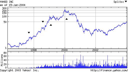
Logarithmic Scale (Y-axis)
The
first graph uses a linear/arithmetic scale, and the y-axis units are
spaced out in a uniform rate: (50, 100, 150, 200, etc) In contrast,
this 2nd graph scales the y-axis with a log scale, where the
units now represent exponents of 10. Therefore, on the y-axis, the 1
really means 101 (or 10), the 2 really means 102 (or 100), and the 3 means 103
(or 1000). In other words, at each linear interval the value it
represents is growing at an exponential rate (1=10, 2=100, 3=1000).
With this type of scale, a move from 1 to 2 (ie: 101 to 102) is the same height as a move from 2 to 3 (102 to 103), and both uniformly spaced intervals represent the same percentage increase! In the 2nd
chart, these exponent based intervals have been subsequently translated
to their respective dollar values. But, the y-axis is only labeled at
the same points as the first chart (50, 100, 150, etc). That is why the
interval spacing appears irregular. However, unit per unit, the y-axis is now growing exponentially. Now look at Yahoo stock performance in 1995 and 1996. Now, the $1 to $10 move (1995-96) is just as visually significant as the $10 to $100 move (1998-99).
The
Richter earthquake scale is another log scaled measurement. For
example, a Richter Scale 7 earthquake is actually 10 times more severe
than a Richter scale 6 earthquake because that is the difference
between 106 and 107.
Conclusion: Log
scaling removes the "flatline" effect, and entire graph is shown in
relative percentage terms. This allows you to compare relative
increases of different sections of the graph without some sections
appearing to be flat because the nominal/absolute change was not
significant, when the percentage change actually was.
Sid Soni Math and Computer Science Dept. Somers High School Westchester County, NY http://www.thesoni.com